Mary Murray • Product & UX Design
Flyp
Design & Strategy for Android and iPhone apps at an early-stage start-up
Challenge: Different markets, One App
While I was at Flyp the company moved into multiple new markets, including Mexico and the Dominican Republic.

Flyp's expansion into multiple markets
Flyp appealed to people abroad for different reasons than in the United States. Domestically Flyp’s main selling point was that it allowed customers to use multiple numbers on one phone. In Mexico and the Dominican Republic, Flyp's main benefit was it allowed customers to call the United State inexpensively.


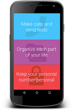
In the United States, Flyp's main selling point was the ability to receive multiple numbers for different aspects of your life.
The new market also meant a change in the pricing model, from freemium in the United States (the first number is free), to a one-week free trial in the Dominican Republic and Mexico.
We didn't have enough engineering resources to create a new app for each market. As a UX Designer my challenge was to sell, explain, and implement a new pricing model - while making minimal functional changes to the app.
Strategy
Changing the initial onboarding screens which contained marketing messages was relatively easy for the developers, so I designed new ones for the Dominican Republic and Mexico that emphasized cost and quality.

The Mexican and Dominican Republic onboarding screens in English and Spanish. These screens emphasized affordability and quality.
I also designed the UX and UI for the new pricing strategy. In large part the UI consisted of banners and dialogs that encouraged the customer to sign-up for Flyp - and alerted them to how much time was left in the trial. The banners and dialogs were implemented in the third party software - Localytics, which eased the burden on the engineering team.
The deliverables for this project included a Google Doc detailing the changes which I created and managed, as well as an InVision prototype that I used for remote usability testing. The Google Doc was a convenient way for the team to give feedback on the design, including adding Spanish translations to the text. You can view the Google Doc here.


After the trial period ended, customers could still receive voicemails and texts, but they would not be able to make or receive live calls. The screens to the left displays a notification of a new voicemail message. The screen to the right shows what would be displayed if the customer tapped the notification.
Banners counting down the days left in the trial period and encouraging customers to subscribe to Flyp.
Usability Testing

Participants in the Mexican and Dominican Republic usability study (faces are invented)
I remotely tested the onboarding message, the registration process, and the app functionality with users in Mexico and the Dominican Republic. The results of the testing brought home to me the challenge we faced with Flyp serving a fundamentally different function to these users. Participants were confused about why they received a US number and why they could get multiple numbers. Many participants were also confused about how the app worked and how they would be charged.
On the positive side, I learned that the participants were savvy consumers of phone plans that allowed them to make international calls, and that in general there was real excitement about being able to make more affordable calls to the US without an internet connection. I suspected that a customer in Mexico might be willing to jump through hurdles that domestic customers wouldn't for the ability to make more affordable and quality calls.

Participants reaction to the onboarding and exploring the app.
Recommendations
Since users were confused by the US number, and it wasn’t something that could be changed, I recommended making receiving a US number a selling point.

I also recommended adding a “Flyp Tip” section on the number picker screen - explaining how the app works and adding additional explanations when the user is exploring paying for the app - or extending the trial.
My plan was to test these changes with potential customers, and to continue making iterative improvements to the experience based on the testing results. (Unfortunately the start-up ran out of money.)

I proposed adding a "Flyp tips" section to the number picker screen to explain to users how Flyp calls work.